Did you know that 85 percent of smartphone users today prefer to use mobile apps to mobile websites? Even though a mobile app accounts for a large portion of sales, only a few retailers provide one!
Given such a market opportunity, any e-commerce company looking to increase sales should seriously consider developing a mobile app. When it comes to e-commerce, creating a great customer experience for your buyers is critical to your success. Because UX is so important in any mobile app, stay updated on the latest UX industry trends and statistics.
Mobile users impose some key elements that you must understand by professional ghost writers before developing a mobile app.
Best Tips for E-Commerce Mobile App Development
Simple and Clear Design
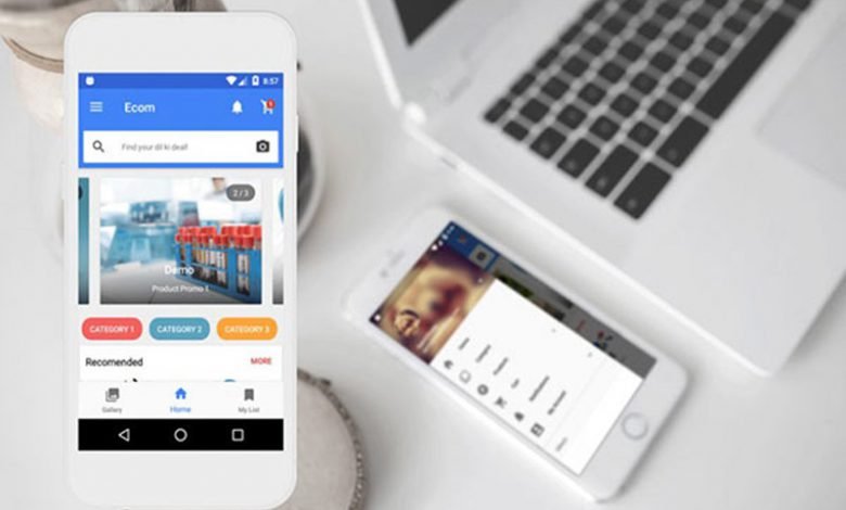
The user interface (UI) is the first thing that users see when they launch an eCommerce app; it allows them to enter the app, navigate and explore the categories, and conduct searches.
Keep in mind that the screen size of a mobile device is much smaller, so space is limited – the home screen should focus on having a clear layout with an easy navigation system and search features, and each button, menu, or content should be well organized and neat.
Your design should be intuitive so that users can easily navigate the app – your UI should not make them think:
- Avoid complicated designs that include a lot of text or animation.
- Avoid UI clutter because your users want to find the product they want as efficiently as possible.
- Use straightforward color schemes, such as monochromatic or analogous schemes.
- Pay attention to spacing – lines and dividers are excellent tools for emphasizing different screen sections, but shadows and colors can also be used to achieve the same effect.
- Use only one typeface, or play it safe using the platform’s default font, such as San Francisco for iOS or Roboto/Noto for Android. Rather than using a different font, it is sometimes better to experiment with the chosen typeface’s size, style, or weight.
Quick Login and Checkout
Nothing irritates more than having to type in the same information repeatedly, such as an email address, name, surname, address, security questions, and so on.
Do not irritate users while logging in or out – touch screens are more distracting for writing because they lack a physical keyboard. Customers will leave if your login/checkout process is too lengthy.
As previously stated, it is a good idea to enable social media login via Gmail, Facebook, or any other preferred social network so that customers can quickly log in without having to enter a lot of information.
Using social media has an added benefit if you create a ‘Share’ button – this allows your customers to share what they have purchased on social networks while also advertising your business.
To avoid those repetitive tasks, you should offer to save user information and use auto-complete.
The same is valid for checkout – do not ask users for personal information unless necessary. Remember that it must fit the smartphone screen without scrolling.
Here are some examples of how you can ensure streamlined service:
- The buttons’ PAY’ and ‘CHECKOUT’ must be placed in a thumb-friendly zone.
- Allow users to change their order.
- Make use of autofill fields.
- Implement error messaging to prevent orders from failing due to typos or missing fields.
Consistency and Simple Navigation
One of the most crucial design principles is to keep your mobile app consistent – that is, to have similar elements behave and look the same way.
Consistency can be defined as:
Visual Consistency
All buttons, fonts, and color schemes should be the same.
Functional Consistency
Interactive elements (such as navigation elements) should behave consistently across screens.
External consistency
For example, all of your products (for example, a website and Android and iOS apps) should follow the same design patterns.
For example, if your’ Pay Now’ button is green on one page, it should also be green on all other pages.
Consistency has numerous advantages, such as making your app more predictable. Users do not have to learn new ways to navigate your app; it eliminates confusion, aids in content prioritization, and elicits a positive emotional response.
You must ensure that your menu is placed throughout the app, listing only the most critical sections and that each menu item can be understood with a single word.
It is best to use standard elements such as the tab bar on iOS or the navigation drawer on Android. When considering gesture-based navigation, consider well-known patterns that all users intuitively understand, such as double-tapping to zoom in on a photo or scrolling down if you wish to explore more products.
Make Navigation Visible
If you have a side menu, users should be able to see how to access it easily.
By using different colors, you can also increase the visibility or priorities of some navigation elements.
Prominent Cart Button
- Because every customer will use to purchase products from you, the cart should always be visible.
- It should display clearly and allow users to add products without taking them to the cart page, allowing them to continue shopping.
- Do whatever it takes to reduce the number of steps and provide a better shopping experience.
- Product screens should always have a visible and prominent ‘Add to Cart’ or ‘Buy Now’ button – this will help simplify the buying experience for the customer and increase sales.
- Check that users can easily add and remove items from the cart.
One Hand Input
In the world of smartphones and touch screens, you must strategically place elements that will entice users to take a specific action.
Thumb-friendly zones are areas of the screen where a user’s thumb can easily reach while holding a phone in the same hand.
Check to see if all of your elements are in the thumb-friendly zone, as people will not bother if they cannot easily reach something.
- What buttons should go in the thumb-friendly zone?
- Add to the shopping cart.
- The Proceed button takes you from the cart to the checkout.
- The pay button is located on the payment screen.
Another way to keep things simple is to follow the ‘Three-Tap Rule,’ which states that it should take no more than three taps for users to get any of the products they want to buy.
This requirement can be met by categorizing and arranging your products. You can arrange your products in the following ways:
- Categories
- Subcategories
- Product
Tags can also be used to organize products into specific campaigns such as ‘Christmas Sale’ or ‘Valentine Gifts,’ for example.
Regardless of how you proceed, the search bar is essential because it allows users to navigate directly to the products they are interested in.
If you want to go the extra mile, you can use Smart Search, which displays several possible suggestions as a user types in the first letters. You will not only save users’ time, but you will also have the opportunity to display some hot product selections.
The Three Tap Rule is nothing more than a rule for reducing the number of steps in all processes such as product browsing, adding to cart, payment, etc.